 세계은행이 발행한 정책보고서 「번영을 위한 이주 : 국제이주와 노동시장」 표지
CHAPTER ONE 1장
Patterns of Global Migration 국제이주 패턴 ①패턴의 개요
오늘날의 언론 헤드라인은 세계가 역사상 가장 심각한 이민과 난민 위기에 직면해 있다는 인식을 심어준다. 최근 몇몇 고소득 경제협력개발기구(OECD) 국가들의 선거와 국민투표는 주요 이슈 중 하나로 이주를 꼽았다. 하지만 이 데이터는 국제 이주 패턴에 대해 우리에게 무엇을 알려주나? 국제이주 데이터가 이러한 문제를 뒷받침하는가, 아니면 다른 사례를 제시하는까? 이 장의 목표는 국경 내부와 국경을 넘는 이동성의 주요 패턴을 탐색하고 그것이 대중의 인식에 어떻게 부합하는지 보는 것이다. 강조된 패턴은 이러한 패턴을 발생시키는 기본 결정 요인을 더 자세히 조사하고 다양한 영향을 검토하면서 다음 장에서 자주 재검토될 것이다.
이주 데이터는 글로벌 패턴에 대한 일반적인 인식과는 확연히 다른 그림을 보여준다. 1960년대 이후, 그리고 세계적으로 비교 가능하고 포괄적인 데이터의 가장 초기 수집 이후, 국제 이주 인구는 절대적인 숫자로 증가했지만 여전히 세계 인구의 상대적으로 작고 안정적인 비율을 나타낸다. 이 수치는 국제 무역, 외국인 직접 투자 및 자본 흐름, 관광객 수 또는 국제 항공편과 같이 세계 경제 통합의 다른 일반적으로 사용되는 지표들과 극명한 대조를 이룬다. 이러한 수치는 절대적이고 상대적인 측면에서 모두 가파르게 상승한 반면, 빠르게 통합되는 세계에서는 이주율이 상대적으로 일정하게 유지되고 있다.
시간이 지남에 따라 크게 달라진 것은 전체 이민자 수가 아니라 전 세계 지역에 걸친 이민자 분포이다. 서유럽, 북미, 그리고 중동의 석유 수출 걸프협력회의(GCC)1 국가들은 목적지로 훨씬 더 중요해졌다. 나머지 국가들은 상대적 중요성을 잃었다. 비슷하게, 원산지 국가의 구성은 같은 기간 동안 변화했다. 가장 심오한 시사점과 그에 따른 정치적 격변으로 이어진 것은 이러한 구성 변화이다.
이민(유입)은 현재 몇몇 목적지 국가 내에 고도로 집중되어 있지만, 이민(전출)은 훨씬 덜 집중되어 있다. 2010년, 상위 10개국은 세계 이민자(전출)의 40% 미만을 차지했고, 상위 10개국은 세계 이민자(유입)의 60% 이상을 수용했다. 1970년 이후 이주자 파견국 수는 증가했지만, 제한된 수의 목적지 국가에서의 집중도는 변함이 없었다.
난민들의 움직임은 경제 이민자들의 움직임과 다르다. 난민 흐름은 아프가니스탄이나 시리아 아랍 공화국에서의 전쟁과 같은 군사적, 내적 갈등에서 비롯된다. 결과적으로, 난민들의 수는 이민자들의 수보다 시간이 지남에 따라 훨씬 더 가변적이다. 난민들은 몇몇 분쟁 지역에서 기원하는 경향이 있고 대부분 이웃 국가에 거주하며, 따라서 경제적 이민자들보다 훨씬 더 집중되어 있다.
마지막으로, 특히 노동 시장의 맥락에서 이주민의 몇 가지 특성은 강조할 가치가 있다. 이주민들은 젊은 사람들, 특히 노동 연령의 성인이 될 가능성이 더 높다. 남성과 여성은 같은 비율로 이주하는 경향이 있다. 그리고 더 많은 교육을 받은 사람들은 더 많이 이주하고, 더 멀리 이주할 가능성이 높다. 이러한 특성의 주요 패턴은 이 장에서 논의된다. 이러한 패턴의 원인과 함의는 다음 장에서 제시된다.
Overall migration patterns 이주 패턴 개요
Global patterns 국제 패턴
2015년 현재, 전 세계적으로 2억 4천만 명 이상의 이민자가 있으며, 이는 1990년 1억 4천만 명보다 70% 이상 증가한 수치이며, 1960년 9천만 명보다 160% 증가한 수치이다. 이주자 수는 제2차 세계 대전 이후 1990년 이후 연평균 2.8%의 비율로 꾸준히 증가해 왔다. 2000년에서 2010년 사이에 성장이 가장 강하여 연 3.3%에 도달했다가 2010년에서 2015년 사이에 연 1.9%로 감소했습니다. (데이터 소스, 정의 및 기타 세부 사항은 부록 참조.)
이 기간 동안 전 세계 인구 대비 이민자 수는 안정적으로 유지되었다. 그림 1.1에서 보듯이, 이민자들은 1990년에 세계 인구의 2.7 퍼센트를 차지했고 2015년에는 3.3 퍼센트를 차지했다. 이처럼 전 세계 인구 대비 이민자 비율 상승이 더딘 것은 세계 인구에 맞춰 이민자 수가 늘었기 때문이다. 대조적으로, 국제 무역과 자본 흐름의 양은 기하급수적으로 증가하여, 국내총생산(GDP)에서 차지하는 비중으로 1990년과 2015년 사이에 3배 이상 증가했다.
지역 패턴
비교적 안정적인 세계 이주 공유의 이면에는 전반적인 지형을 지배하고 진행 중인 정책 논쟁을 형성하는 몇 가지 중요한 패턴이 있다. 첫 번째 눈에 띄는 패턴은 이주자 인구가 특히 노동력 부족과 비교적 자유로운 이민 체제를 가진 부유한 국가에서 몇몇 목적지 지역에 집중되어 있다는 것이다. 이러한 집중은 임금격차와 소득상승이 이주패턴을 결정하는 주요 견인요인이기 때문에 예상할 수 있으며, 이는 다음 장에서 더 자세히 논의될 것이다.
그림 1.2는 목적지 지역 전체의 국제 이민자 분포를 보여준다. 전 세계 이민자의 3분의 2가 북미, 서유럽, 동유럽, 그리고 중동의 고소득 국가에 거주한다. 이들 지역 대부분에서 점유율은 1970년대 이후 빠르게 증가하고 있다. 2010년, 모든 국제 이민자의 거의 4분의 1이 서유럽에 있었고, 또 다른 4분의 1은 북아메리카에 있었으며, 약 10%는 고소득의 석유 수출국인 중동과 북아프리카(MENA) 국가에 있었다. 이러한 집중은 동유럽과 중앙아시아(ECA)와 남아시아의 국가들로부터의 이동과 함께 나타났다. 사하라 이남 아프리카(SSA), 중남미(LAC), 동아시아 태평양(EAP)과 같은 비교적 큰 지역은 글로벌 이주 인구가 적은 것으로 유명하다. 이들 지역은 전 세계 인구의 45%가 살고 있지만 전체 이주 주식의 15%만 보유하고 있다.
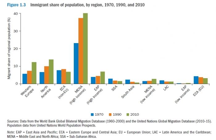
세계의 부유한 지역에 이민자들의 집중이 증가했다는 것은 이들 지역의 지역 인구에 대한 그들의 비율 또한 빠르게 증가했다는 것을 의미한다. 이 패턴은 이러한 고소득 지역에서 이주 흐름의 경제적, 사회적, 정치적 영향에 대한 관심이 증가하는 것을 설명하는 데 도움이 된다. 그림 1.3은 목적지 지역별 이민자-최고 인구 비율을 나타낸다. 1970년부터 2010년까지 서유럽, 북미, 중동의 고소득 국가들은 이민자 인구의 상당한 증가를 경험했다. 이러한 성장은 특히 석유 수출국들의 경제가 변화하고 소득 수준이 빠르게 상승함에 따라 외국인 노동력의 대규모 유입에 의존하고 있는 GCC 국가들의 경우 두드러진다. 2010년 기준으로 이 나라 인구의 40% 이상이 이민자로 구성되어 있으며, 이는 평균적으로 원주민 3명당 2명의 이민자가 있음을 의미한다. 인구 대비 이민자 비율은 쿠웨이트, 카타르, 아랍에미리트에서 75% 이상에 달하는데, 4명 중 3명은 외국 태생이다. 북미와 서유럽 국가들은 이민율이 각각 14%와 12%로 훨씬 낮다. 우리는 싱가포르와 중국 홍콩 SAR와 같은 EAP 지역의 몇몇 고소득 경제도 최근 수십 년 동안 이민자들의 허브가 되었다는 것에 주목해야 한다. 전체 인구에서 이주민이 차지하는 비중은 2015년 기준 싱가포르와 홍콩 SAR에서 각각 45%와 39%에 달했다. 그러나, 이러한 상대적으로 적은 인구를 고려할 때, 이들 지역 총계는 그들의 큰 점유율을 반영하지 않는다.
Country-level patterns 국가 수준 패턴
이민(유입)과 이민(전출)율은 나라마다, 심지어 같은 지역 내에서도 크게 다르다. 지도 1.1은 1970년(패널 a)과 2015년(패널 b)의 국가별 이민자 대 가정 인구 비율을 나타낸다. 상당히 안정적이긴 하지만, 남아메리카와 동남아시아와 같은 지역에서 이민자 비율이 빠르게 증가함에 따라, 세계 일부 지역에서 이민자 대 가정 인구 비율이 크게 변화했다. 그 결과는 1970년보다 2015년에 비교적 균일한 지도이다. 이민자들은 대부분의 국가에서 인구의 10퍼센트 미만을 차지한다. 예외는 대부분 앤티가 바부다, 가이아나, 수리남과 같은 작은 나라들과 아일랜드와 포르투갈과 같은 부유한 나라들입니다.
지도 1.2는 1970년(패널 a)과 2015년(패널 b) 국가별 이민자 대 총인구 비율을 보여준다. 이 기간 동안 일부 국가에서는 감소, 다른 국가에서는 상당한 증가 등 이민자 인구 비율의 분명한 변화가 있었다. 놀랍게도, 소수의 국가들은 2015년 지도에서 현저하게 어두워졌다. GCC 국가들이 1970년부터 2015년까지 지역 이주를 위한 중심지로 부상한 것은 이전 섹션에서 언급했듯이 분명하다. 게다가 호주, 캐나다, 뉴질랜드에서는 이민자들 비중은 20퍼센트 이상을 차지한다. 서유럽과 미국의 대부분 지역에서, 비율은 10퍼센트 이상이다. 하지만, 대부분의 국가에서 이민자 대 인구 비율은 이보다 현저히 낮다.
Bilateral patterns 양방향 패턴
비록 많은 이주자들이 여전히 그들의 지역 내에서 이주하지만, 그들의 지역 밖으로 이주하는 사람들의 비율은 점차 증가하고 있다. 양자 간 글로벌 이주 데이터는 이주민의 기원과 목적지를 분석할 수 있기 때문에 특정 이주 경로의 역할을 탐색할 수 있다. 세계화는 낮은 교통비와 통신비를 통해 지리적 거리에 의해 부과되는 이동 비용을 줄이는 데 도움을 주었고, 이민자들이 가까운 이웃 국가들을 넘어 목적지를 찾을 수 있게 했다. 여전히 전체 세계 이동의 약 3분의 1이 지역 내에 남아 있다. 이는 그림 1.4에서 보듯이 1960년의 56%에서 감소한 것이다.( 데이터에 대한 자세한 내용은 부록 참조)
지역 내 이동성의 감소는 전 세계의 거의 모든 지역에서 발생했으며, 남아시아는 특히 큰 감소를 경험했다(그림 1.5 참조). 남아시아 국가로부터의 이민의 거의 모든 것(90%)은 1970년에 지역 내였지만, 그 비율은 2010년에 약 3분의 1로 감소했다. 이러한 지역 이동성 감소의 상당 부분은 고소득 MENA 국가, 미국 및 영국으로 노동력 이주가 증가했기 때문이다. 게다가, 인도의 분할과 그에 따른 난민 흐름은 2차 세계대전 이후 수십 년 동안 지역 내 이주자 수가 높은 주요 원인이다. 시간이 지남에 따라, 그리고 주로 사망률 때문에, 이러한 이주민의 수와 지역 이주 비율은 다음 수십 년 동안 감소했다.
세계의 다른 가난한 지역에서는 여전히 지역 내 이주가 상대적으로 높다. 예를 들어 SSA에서는 전체 이주의 약 3분의 2가 지역 내 이주이다. 마찬가지로, 비유럽연합(EU) ECA 국가에서 온 이민자의 약 3분의 2가 이 지역 내에서 이주한다. 유일한 예외로, 서유럽의 지역 내 이주는 1970년과 2010년 사이에 꾸준히 증가했다. 이러한 증가는 대부분 회원국 간에 사람들이 자유롭게 이동할 수 있도록 하는 EU의 무료 노동 이동 조항 때문이다. 이러한 흐름은 특히 독일, 네덜란드, 영국과 같은 고소득 국가로 향한다.
상위 지역 이동 경로 중 일부는 현재 지역 간이다. 표 1.1은 1970년과 2015년 10개의 가장 큰 지역 이주 통로를 보여준다. 1970년, 5개의 가장 큰 지역 통로 중 4개가 비EU ECA, 남아시아, 서유럽에 의해 주도되었다. 2015년까지 1, 3번째로 큰 지역 경로는 LAC에서 북미, 남아시아에서 고소득 MENA 국가까지 지역 외 통로이다. 그러나 상위 5개 이주 경로 중 3개는 지역에 남아 있다. 비 EU ECA 외에도 SSA와 서유럽의 지역 경로이다. 전체적으로 지역 내 이동 패턴과 마찬가지로, 5대 지역 흐름은 전체 세계 이동에서 차지하는 비중이 1970년 약 55%에서 2015년 40% 미만으로 감소했다.
그림 1.6은 2010년 지역 간 모든 이주 경로의 크기를 보여준다. 경로의 두께는 출발지 지역(왼쪽)에서 목적지 지역(오른쪽)까지의 이주 규모의 크기에 해당합니다. 이 수치는 세계 이주의 순전한 복잡성을 보여주는 것 외에도 국제 이주의 패턴에 대한 많은 흥미로운 통찰력을 제공한다. 첫째, 앞서 논의한 바와 같이 대부분의 경우 각 지역 출신 이민자들이 가장 많이 찾는 여행지는 해당 지역 그 자체이다. 중요한 예외는 서유럽을 여행하는 유럽 연합 회원국의 이민자, 북아메리카를 여행하는 라틴 아메리카 국가의 이민자, 그리고 고소득 MENA 국가로 여행하는 남아시아 국가의 이민자이다. 게다가, 국제 이주민의 순수입자와 순수출자가 매우 뚜렷하다. 반면에, 북미, 서유럽, 고소득 MENA 국가들과 같은 부유한 지역들은 그들이 보내는 것보다 훨씬 더 많은 이민자들을 끌어들인다. 반면에, 라틴 아메리카, 남아시아, 그리고 저소득 동아시아 국가들은 그들이 받는 것보다 더 많은 이민자들을 보낸다. 잠재적 이민자, 목적지 및 이민 결정 요인에 대한 추가 논의는 박스 1.1을 참조한다.
박스 1.1 잠재적 이주민과 이주 욕구
갤럽 세계 여론 조사는 150개국 이상의 응답자들에게 그들이 이주하고 싶은지 그리고 만약 그렇다면, 그들이 어느 나라로 갈 것인지 물어봄으로써 잠재적인 이민자들을 확인하려고 한다. 갤럽(2017)은 2010년부터 2012년까지 실시한 조사에서 전 세계 인구의 13%가 이주하기를 원하지만 그렇게 하지 않은 것으로 나타났다.
표 B1.1.1은 지역별로 잠재적 이주민의 비율을 나타낸다. 지역마다 상당한 이질성이 존재하며, 이러한 변화의 상당 부분은 소득의 급격한 차이로 설명될 수 있다. 예를 들어, 사하라 이남 아프리카 인구의 30%는 다른 나라로 이주하기를 원하는 반면, 훨씬 부유한 북미와 오세아니아(호주와 뉴질랜드가 총 인구를 지배하고 있는)에서는 그 비율이 10% 이하이다.
가장 원하는 목적지의 측면에서, 경제적 동기는 훨씬 더 분명하다. 표 B1.1.2는 잠재적 이민자들에게 가장 인기 있는 10개의 목적지를 보여준다. 이들 상위 10개 여행지는 전체의 56%인 3억9200만 명의 잠재적 이민자를 차지한다. 놀랍게도, 이것은 또한 세계 상위 10개 목적지에 거주하는 실제 이주민의 비율과 거의 동일하다(그림 1.7 참조). 이들 여행지 중 9곳이 고소득 서방국가 중 가장 크다. 마지막인 사우디아라비아는 고소득 중동과 북아프리카 국가 중 가장 큰 나라로 남아시아와 동남아시아에서 온 이민자들이 많이 찾는 곳이다.
CHAPTER ONE
Patterns of Global Migration
Today’s media headlines create a perception that the world is facing history’s most severe migration and refugee crisis. Recent elections and referendums in several high-income Organisation for Economic Co-operation and Development (OECD) countries had migration as one of their leading issues. But what do he data tell us in terms of global migration patterns? Do the migration data upport these concerns or suggest a different story? The goal of this chapter is to explore the main patterns of mobility within and across national borders and see how they fit the public perception. The highlighted patterns will be frequently revisited in the following chapters as we delve further into the underlying determinants that give rise to these patterns and as we examine their various impacts.
Migration data reveal a starkly different picture from the commonly held perceptions on global patterns. Since the 1960s, and the earliest collection of globally comparable and comprehensive data, international migration stocks have increased in absolute numbers but still represent a relatively small and stable share of the world population. This measure is in stark contrast to other commonly used indicators of global economic integration, such as international trade, foreign direct investment and capital flows, and number of tourists or international flights. These measures have risen steeply in both absolute and relative terms, whereas migration rates have remained relatively constant in an otherwise rapidly integrating world.
What has changed substantially over time is the distribution of migrants across regions of the world, not the total numbers of migrants. Western Europe, North America, and the oil-exporting Gulf Cooperation Council (GCC) countries1 of the Middle East have become considerably more important as destinations—with the rest of the world losing relative importance. Similarly, the composition of origin countries has changed over the same time frame. It is this compositional change that has led to some of the most profound implications and subsequent political upheavals.
Immigration is now highly concentrated within a few destination countries, but emigration is much less concentrated. In 2010, the top 10 origin countries epresented less than 40 percent of the world’s emigrants, whereas the top 10 destination countries hosted over 60 percent of the world’s immigrants. Since 1970, the number of migrant-sending countries has increased, but the concentration in a limited number of destination countries has remained unchanged.
The movements of refugees are different from those of economic migrants. Refugee flows result from military and civil conflicts, such as the wars in Afghanistan or in the Syrian Arab Republic. Consequently, the number of refugees is far more variable over time than the number of immigrants. Refugees tend to originate from a few conflict areas and reside mostly in neighboring countries and are, thus, far more concentrated than economic migrants.
Finally, a few characteristics of migrants are worth highlighting, especially in the context of labor markets. Migrants are more likely to be young, particularly working-age adults. Men and women tend to migrate in equal proportions. And more-educated people are more likely to migrate and to migrate farther. The main patterns of these characteristics are discussed in this chapter. The causes and implications of such patterns are presented in the following chapters.
Overall migration patterns
Global patterns
As of 2015, there were slightly more than 240 million migrants worldwide, an increase of over 70 percent from the 140 million migrants in 1990 and a 160 percent increase from the 90 million in 1960. Migrant stocks have grown steadily throughout the post–World War II period, at an average annual rate of 2.8 percent since 1990. Growth was strongest between 2000 and 2010, reaching an annual rate of 3.3 percent before declining to 1.9 percent per year between 2010 and 2015. (Please see the discussion of data issues in the appendix for data sources, definitions, and other details.)
Migrant stocks as a percentage of the global population have remained stable throughout this period. As seen in figure 1.1, migrants represented 2.7 percent of the global population in 1990 and 3.3 percent in 2015. This slow growth of the global migration-to-population ratio is because the number of migrants broadly rose in line with the world’s population. In contrast, the volume of both international trade and capital flows grew exponentially, more than tripling between just 1990 and 2015 as a share of gross domestic product (GDP).
Regional patterns
Underneath the relatively stable global migration shares lie several critical patterns that dominate the overall landscape and shape the ongoing policy debate. The first striking pattern is that migrant stocks are heavily concentrated in several destination regions, especially in wealthier countries with labor shortages and relatively liberal immigration regimes. This concentration is to be expected because wage gaps and income gains are the primary pull factors that determine migration patterns, as will be discussed in greater detail in the following chapter.
Figure 1.2 presents the distribution of international migrants across destination regions. Two-thirds of the world’s immigrants reside in North America, Western Europe, Eastern Europe, and high-income countries of the Middle East. The shares in most of these regions have been increasing rapidly since the 1970s. In 2010, almost a quarter of all international migrants were in Western Europe, another quarter in North America, and about 10 percent in high-income, oil-exporting Middle East and North African (MENA) countries. This concentration emerged alongside a shift in migration away from countries in Eastern Europe and Central Asia (ECA) and South Asia. Relatively large regions like Sub-Saharan Africa (SSA), Latin America and the Caribbean (LAC), and East Asia and Pacific (EAP) are notable for their smaller shares of global migrant stocks. These regions are home to 45 percent of the global population yet host only 15percent of total migrant stocks.
The increased concentration of immigrants in wealthier regions of the world implies that their share relative to the local populations of these areas has also increased rapidly. This pattern helps to explain the increased attention to the economic, social, and political ramifications of migration flows in these high-income regions. Figure 1.3 depicts immigrant-topopulation shares by destination region. From 1970 to 2010, the highincome countries of Western Europe, North America, and the Middle East experienced substantial growth in their immigrant populations. The growth is especially striking for the oil-exporting GCC countries, which rely on large inflows of foreign labor as their economies have transformed and their income levels have risen rapidly. As of 2010, over 40 percent of the population in these countries was composed of immigrants, implying that there are, on average, two immigrants for every three native-born people. The immigrant-to-population ratio reaches over 75 percent in Kuwait, Qatar, and the United Arab Emirates, where three out of every four people are foreign born. North American and Western European countries have much lower immigration rates, at 14 and 12 percent, respectively. We should note that several high-income economies of the EAP region, such as Singapore and Hong Kong SAR, China, have also become hubs for immigrants in recent decades. The share of migrants in the total population reached 45 and 39 percent in Singapore and Hong Kong SAR, China, respectively, as of 2015. However, given the relatively small populations in these economies, the regional aggregates do not reflect their large shares.
Country-level patterns
Immigration and emigration rates vary significantly across countries and even within the same region. Map 1.1 depicts the emigrant-to-home population ratios by country in 1970 (panel a) and 2015 (panel b). Although fairly stable, emigrant-to-home population ratios have changed substantially in some parts of the world, with rapid increases in emigration rates in regions like South America and Southeast Asia. The result is a relatively more uniform map in 2015 than in 1970. Emigrants represent less than 10 percent of the population in most countries. The exceptions are mostly smaller countries like Antigua and Barbuda, Guyana, and Suriname and some wealthier countries such as Ireland and Portugal.
Map 1.2 shows the immigrant-to-total population ratios by country in 1970 (panel a) and 2015 (panel b). Over this period there have been evident shifts in immigrant-to-population ratios, with declines in some countries and significant increases in others. Strikingly, a handful of countries became significantly darker in the 2015 map. The emergence of the GCC countries as a hub for regional migration from 1970 to 2015—as mentioned in the previous section—is clear. Additionally, in Australia, Canada, and New Zealand, immigrants make up more than 20 percent of the population. In much of Western Europe and the United States, rates are more than 10 percent. However, immigrant-to-population ratios are significantly lower in most of the countries.
Bilateral patterns
Although many migrants still move within their own regions, the share of people moving outside of their region has been gradually increasing. Bilateral global migration data allow us to explore the role of specific migration corridors because we can analyze migrants’ origins and destinations. Globalization has helped reduce mobility costs imposed by geographic distances through lower transportation and communication costs, allowing migrants to seek out destinations beyond their immediate neighboring countries. Still, about a third of total global migration remains intraregional, down from 56 percent in 1960, as seen in figure 1.4 (please see the appendix for further details on data).
The decline in intraregional mobility has occurred across almost all regions of the world, with South Asia experiencing a particularly large decline (see figure 1.5). Nearly all (90 percent) of emigration from South Asian countries was intraregional in 1970, but the ratio declined to about a third in 2010. A significant share of this decline in regional mobility is due to the increased labor migration to high-income MENA countries, the United States, and the United Kingdom. Furthermore, the partition of India and the subsequent refugee flows are the main reasons behind the high intraregional migrant stocks during the decades following the Second World War. Over time, and mainly because of mortality, the number of these migrants and the share of regional migration declined in the following decades.
In other poor regions of the world, intraregional migration is still relatively high. For example, in SSA about two-thirds of all migration is intraregional. Similarly, about two-thirds of emigrants from non–European Union (EU) ECA countries migrate within the region. (A large share of the intraregional migration within the ECA region is also due to the dissolution of the Soviet Union and the overnight creation of new national borders.) As the sole exception, Western Europe’s intraregional migration increased steadily between 1970 and 2010. This increase is in most part due to the free labor mobility provisions of the EU that allow people to move freely among the member countries. These flows are especially directed toward higher-income countries such as Germany, the Netherlands, and the United Kingdom.
Some of the top regional migration corridors are now between regions. Table 1.1 shows the 10 largest regional migration corridors in 1970 and 2015. In 1970, four of the five largest regional corridors were intraregional, led by non-EU ECA, then South Asia, then Western Europe. By 2015, the first- and third-largest regional corridors were extraregional—from LAC to North America and from South Asia to high-income MENA countries. However, three of the top five migration corridors remain intraregional. In addition to non-EU ECA, these are regional corridors in SSA and Western Europe. As with intraregional migration patterns overall, the five largest regional flows represent a shrinking share of total global migration, falling from about 55 percent in 1970 to less than 40 percent in 2015.
Figure 1.6 presents the magnitude of every migration corridor between regions in 2010. The thickness of the corridors corresponds to the size of the migrant stock from an origin region (on the left) to a destination region (on the right). In addition to displaying the sheer complexity of global migration, the figure provides many interesting insights into international migration patterns. First, as previously discussed, in most cases, the most common destinations for migrants from each region are countries in that region itself. Important exceptions are migrants from EU-member ECA countries traveling to Western Europe, migrants from Latin American countries traveling to North America, and migrants from South Asian countries traveling to high-income MENA countries. Additionally, there are very clear net importers and net exporters of international migrants. On the one hand, richer regions such as North America, Western Europe, and the high-income MENA countries attract many more migrants than they send. On the other hand, Latin American, South Asian, and low-income East Asian countries send many more migrants than they receive. For additional discussion of potential migrants, their destinations, and the determinants of their migration decisions, see box 1.1.
Box 1.1 Potential migrants and the desire to move
The Gallup World Poll tries to identify potential migrants by asking respondents in over 150 countries whether they would like to move and, if so, to which country they would go. In surveys taken from 2010 to 2012, Gallup (2017) finds that 13 percent of the world’s population would like to migrate but have not done so.
Table B1.1.1 presents the share of potential migrants by region. There is considerable heterogeneity across regions, and much of this variation can be explained by sharp differences in income. For example, 30 percent of the population of Sub-Saharan Africa would like to migrate to another country whereas, in the much richer North America and Oceania (whose gross population is dominated by Australia and New Zealand), the share is 10 percent or less.
In terms of the most desired destinations, the economic motivations are even more evident. Table B1.1.2 presents the 10 most popular destinations of potential migrants. These top 10 destinations account for 392 million potential migrants, 56 percent of the total. Astonishingly, this is also nearly identical to the share of actual migrants who reside in the world’s top 10 destinations (see figure 1.7). Of these destinations, nine are the largest of the high-income western countries. The last, Saudi Arabia, is the largest of the high-income Middle East and North African countries, a popular destination for migrants from South and Southeast Asia.
[※ World Bank. 2018. Moving for Prosperity: Global Migration and Labor Markets. Policy Research Report. Washington, DC: World Bank. doi:10.1596/978-1-4648-1281-1. License: Creative Commons Attribution CC BY 3.0 IGO
This translation was not created by The World Bank and should not be considered an official World Bank translation. The World Bank shall not be liable for any content or error in this translation.
This is an adaptation of an original work by The World Bank. Views and opinions expressed in the adaptation are the sole responsibility of the author or authors of the adaptation and are not endorsed by The World Bank.]
 세계은행이 발행한 정책보고서 「번영을 위한 이주 : 국제이주와 노동시장」 뒷표지
<pinepines@injurytime.kr>